Cutting a small-capitals face
A browser fakes small capitals by shrinking the big ones. This is what it takes to draw them instead.
3 minutes read
587 words
Contents4
Fake small capitals are shrunken capitals. It shows.
Set a word in them and it comes apart. The menu on this site sets anything that opens in small capitals. Ask a browser for that and you write:
font-variant-caps: small-caps;
If the font has small-capital glyphs, you get them. If it does not, the browser makes some by shrinking the capitals, and that is where it goes wrong.
Why the fake ones look wrong
Scale a letter down and everything scales, the stroke included. A capital
A at 85% has strokes at 85%. Set it beside a full-size A that kept its
weight and the two do not belong to the same alphabet. Audio DSP reads as
two fonts arguing.
A type designer solves this by drawing small capitals as their own letters: shorter, but with strokes nearly as thick as the capitals, and usually a little wider to keep the colour even. Nothing about that falls out of scaling.
What the script does
Bricolage Grotesque is variable, with a weight axis running 200 to 800. That axis is the way out. If a scaled-down letter loses stroke weight, take the letter from somewhere heavier before scaling it.
Two numbers set the shape:
HEIGHT = 0.85      # of cap height
WEIGHT = 0.92      # of the capital's stroke
Height is a judgement, and 0.85 is conventional. Weight is not: 0.92 is the target, and the script has to find the axis position that lands there.
It measures rather than assumes. The stem of I is read straight off the
glyph outline, since a font’s own numbers can lie:
def stem(font):
    glyph_name = font.getBestCmap()[ord("I")]
    glyf = font["glyf"][glyph_name]
    return glyf.xMax - glyf.xMin
Then it binary-searches the weight axis, twenty-four times, for the instance whose stem lands on target once scaled:
capital stem 146 at wght 700
small capital wants 134.3, taken from wght 770.2 and scaled to 135.2
161 characters cut
So: the capitals are cut at weight 700, and the small capitals are cut at 770.2 and scaled to 85%. That lands the stroke at 135.2 units against a target of 134.3, which is 0.926 of the capital rather than the 0.85 that plain scaling would have given.
Every character with an uppercase form gets one, 161 of them, and each small
capital is written into the lowercase position. That matters: the face
needs no font-variant-caps at all. Type lowercase and small capitals come
out, so nothing is left for a browser to fake.
Where it stops working
Ask for a 800-weight cut and the search has nowhere to go. The small capitals would need an axis position above 800, and 800 is the ceiling. You get a face whose small capitals are too light and no warning, which is why the script prints what it found and the shipped face is 700.
The face
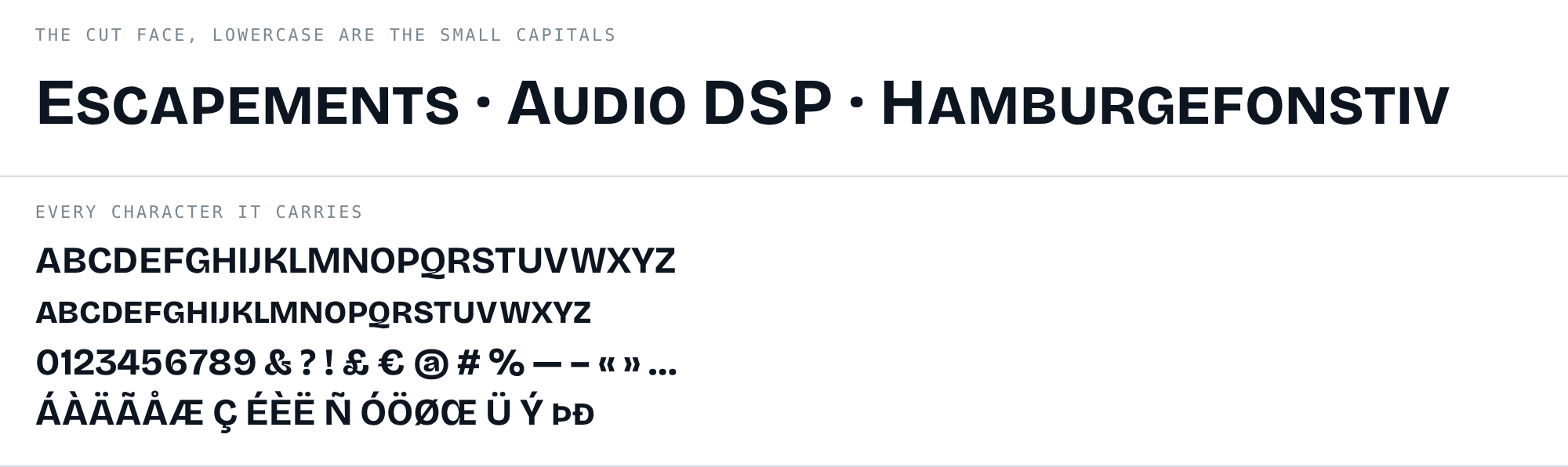
bricolage-smallcaps-700.woff2 · 36 KB · 161 characters · OFL.txt
Bricolage Grotesque is by Ateliers Mathieu Triay. It carries no reserved font name, which is what makes this legal: the Open Font Licence lets a modified version keep the family name only when the original reserves nothing. The original copyright stays inside the file, the cut says what was done to it, and it travels under the same licence.
That detail is not academic. The first face this site used was Source Sans
3, which reserves the name Source, and a subset of it had to go. That
story is in
the theme’s own piece
.
The build script ships in the theme, at scripts/build-smallcaps.py.